

Electricity markets prices over the past several months, most strikingly in South Australia, have stirred a lot of interest in the surge in price levels and volatility, especially as we are entering the summer period of peak demand.
In this blog, we will investigate these outcomes. We are going to use a few sophisticated statistical tools to try and create an intuitive visualisation of what has been happening in the South Australian region of the NEM.
The focus is on how key aspects of this distribution have been changing starting with South Australia. The data used is available from AEMO and statistical tools are freely available from cran.r-project.org. The work presented here has not been funded.
A start to finish version of this blog is available in PDF format from this link
Wind Generation and Demand
The subject for the next few blogs will be prices and wind generation in South Australia. South Australia may foreshadow issues for all NEM regions that are planning to significantly increase wind generation capacity. At the same time, it is important not to just focus on the intermittency of wind generation in South Australia, wind needs to be place into the context of the electricity system.
The relationship between the volatility of wind generation and wholesale electricity prices is hypothesised to revolve about three key factors. These are the level of wind generation capacity relative to:
· Electricity demand
· Local fast start generation capacity, and
· Constraints on imports and exports of power between South Australia and Victoria.
The first point is taken up later in this blog. However, it is the difference between electricity demand and wind generation, referred to as residual demand, that needs to be managed, for the most part, through the normal dispatch system. Fast start generation provides the dispatch system the flexibility to respond changes in and generation and load within a short time frame. Open cycle generally has the shortest start up times and fastest ramp rates (the rate at which output can be adjusted). South Australia’s open cycle gas turbine capacity is currently about 870MW, representing a bit less than 60 per cent of average demand and 30 per cent of peak demand.
Third, interconnections allow AEMO to dispatch power from other NEM regions to South Australia. The main link between South Australia and Victoria is the Heywood interconnector, which was sequentially upgraded in 2016 from 460MW to 650MW and energised in July 2016. The constraint on the exchange of electricity between regions is a system level issue, and often reflects constraints elsewhere in the network or system security considerations (rather than the capacity of an interconnector per se). However, there are two key points from a South Austrian perspective when imports of energy from Victoria are constrained:
· Variation in residual demand needs to be managed through the dispatch of local generation; and
· The market becomes separated and local prices can diverge from Victoria and other NEM regions.
After the South Australian blackout in September 2016, AEMO have reduced transfer limits across Heywood. Presumably these constraints have been imposed to increase system security. However, in principle, this will lead to the South Austrian market becoming separated more frequently adding to the task of managing variability. However, when the South Austrian market becomes separated it creates the opportunity to explore the impact of having a high proportion of demand met by local wind generation.
Share of Operational Demand Met by Wind
The metric we are going to look is the share of half hourly operational demand met by wind generation from 1 September 2015 to 16 January 2017 (the period of the 2016 blackout has again been excluded). The smoothed trend in the share of operational demand met by wind is shown in Figure 20. The most striking point is the sharp increase in the share of wind in the second quarter of 2016. This is due to several factors including seasonal variation in wind generation, the closure of the Northern coal fired station and additional wind generation capacity being brought on line.
Figure 20 The smoothed trend in the share of operational demand met by wind in South Australia: 1 September 2015 to 16 January 2017
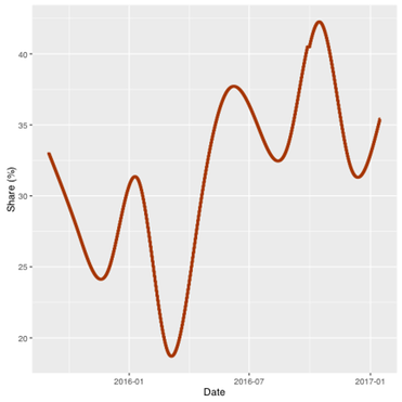
What is more interesting is the reliability wind in meeting this increased proportion of demand, particularly when demand is high, as for example peaks in summer and winter. What would like to see is how the volatility of the share of operational demand met by wind is changing over time, at time scale that matches up with the problem of managing intermittent wind generation. A bit of work needs to be done.
First, the standard deviation of the change in the share of operational demand met by wind is calculated at successively longer time scales; over a half hour, over an hour and so forth. Longer time scales can be created by taking the difference of averages, as for example, the difference in hourly, daily and weekly averages. However, this dampens temporal correlation and variability. Longer time scales can be created by taking successively longer differences in the share of operational demand met by wind without averaging, say from 9:00 to 9:30, 9:00 to 10:00, 9:00 to 11:00 and so forth. This preserves temporal correlation and it is temporal correlation that gives rise to large swings in wind generation and demand. This raw variability, which is still tied to a five-minute interval, is a measure of how much things can change over a given length of time.
The change variability over longer time scales is shown in Figure 21. The variability in the share of operational demand met by wind increases but at a decreasing rate. For instance, there is a sharp increase in variability over the first four hours but this progressively slows and eventually plateaus at 18 hours. After 18 hours, the temporal correlation in the change in share of operational demand met by wind is essential gone. We can use this measure of variability to calibrate a useful picture of how volatility has been changing over time.
Again, a two-stage smooth is used to extract the trend in volatility over time, this time calibrating the smooths to approximate the volatility to a time scale of about two hours. This is done by matching standard deviation of smoothed volatility to about 10 per cent which corresponds to about two hours in Figure 21. The motivation is to try and get a picture of how the scope of problem of managing intermittent generation has changed in South Australia.
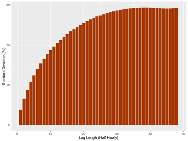
Figure 21. The standard deviation in the share of operational demand met by wind generation over successive time periods in South Australia: 1 September 2015 to 16 January 2017
The first stage smooth, which takes into account the expected pattern of diurnal variation, can be interpreted as the mean or expected share at a point in time. The deviations from trend represent volatility or uncertainty about the expected level demand met by wind. This uncertainty is managed through capacity to adjust the output of dispatch from generators at the same time scale as the volatility. The trend in volatility is obtained by taking successively finer smooths of the deviations from trend until their variability matches the variability of the share of operational demand met by wind over two hours (as shown in Figure 21). Over this time span the flexibility to manage variability comes from generators that are online that can adjust output, fast start new generators that can be brought on line and the ability to import and export energy to Victoria.
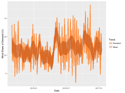
The result, which is intended to be illustrative, is shown in Figure 22. The dark orange bands show expected diurnal pattern in the share of operational demand met by wind. The pattern within the band is constant over each 24 hour period and is repeated so frequently that it fills the band with a solid colour that has been made translucent. The edges of the band are the upper and lower bounds of the expected diurnal variation. The overall pattern jumps sharply toward the end of the first half of 2016 as was seen in figure 20.
The light orange line is the deviation about the diurnal pattern and is the volatility or the uncertainty that needs to be managed. For the most part, volatility falls within the band of diurnal variation but there are spikes that lie well outside these bounds and they occur quite frequently. These spikes are ramp like events are created, for the most part, by irregular cycles in wind speed that were shown in the previous blog. The time from peak to trough would be the order of four hours. The escalation of uncertainty in the second half of 2016 is quite clear, particularly from late June into September, where the magnitude and the frequency of the peaks and troughs are sharply elevated.
Figure 22 The expected diurnal pattern and the volatility of the share of operational demand met by wind: 1 September 2016 to 16 January 2017
The light orange line is the deviation about the diurnal pattern and is the volatility or the uncertainty that needs to be managed. For the most part, volatility falls within the band of diurnal variation but there are spikes that lie well outside these bounds and they occur quite frequently. These spikes are ramp like events are created, for the most part, by irregular cycles in wind speed that were shown in the previous blog. The time from peak to trough would be the order of four hours. The escalation of uncertainty in the second half of 2016 is quite clear, particularly from late June into September, where the magnitude and the frequency of the peaks and troughs are sharply elevated.
Wind generation in South Australia was a primary driver of the volatility of residual demand over the winter month in 2016. However, the relationship between demand and wind also contributed. Demand and wind generation output were negatively correlated. That is, higher than average demand is associated with lower than average wind generation. Over the entire period this correlation was only about 12 per cent but this jumped to 25 per cent in July and August of 2016.
Meeting demand with a high proportion of wind generation is, as hypothesis at start of this blog suggested, one factor that is likely to be a source of increased price volatility in South Australia. Other factors may be a prerequisite or of equal or greater importance. Infrastructure is brought into the picture in the next blog
Regional Electricity Price Update
The next instalment of the blog is still in progress but we thought it would be good to update the changing electricity price distributions for South Australia, New South Wales and Victoria.
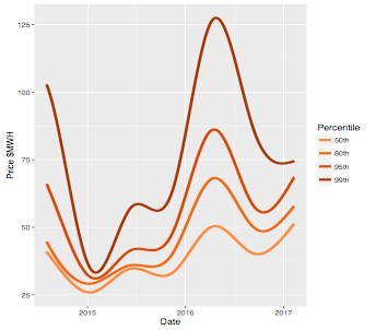
Percentiles of the distribution are shown in each figure from August 2014, after the repeal of the carbon tax, through to February 8th 2017. The percentiles were estimated using local quantile regression. The beginnings of the upper percentiles (the 95th and 99th) are influenced to some extent by the carbon tax and the endpoints should be regarded with some caution.
The escalation in the upper tail of the distribution since the start of 2016 is clear in each of the NEM regions. The fact that the shoulders of the distributions are moving away from the median as well as the tails indicates that price volatility has had a substantial impact on average prices.
The escalation of the tails in New South Wales is of the same order of magnitude as South Australia. In Victoria, it is less pronounced but there is a clear upturn that starting in late 2016
Figure 1. Percentile of the wholesale electricity price distribution in South Australia: August 1 2014 to February 8 2017.
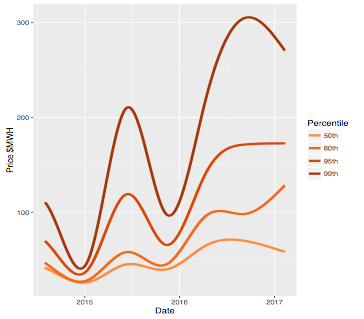
Figure 2. Percentile of the wholesale electricity price distribution in New South Wales: August 1 2014 to February 8 2017.
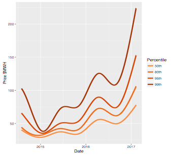
Figure 3. Percentile of the wholesale electricity price distribution in Victoria: August 1 2014 to February 8 2017.
Wind Generation
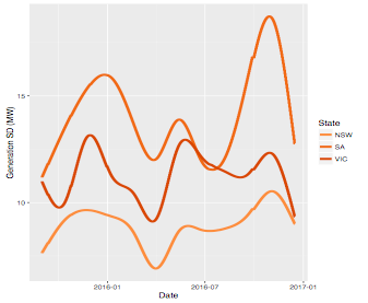
We start by looking at some general characteristics of wind generation in New South Wales, South Australia and Victoria. The AEMO data are actual generation for semi-scheduled wind farms in each state at five minute intervals from September 1 2015 to 16 January 2017. Data for the 28th through the 30th of September 2016 were removed due to the South Australian blackout.
The data are then averaged over half hourly intervals and the standard deviation in wind generation was calculated for each interval. The standard deviation over six five minute intervals is being used as a measure of variability that occurred over half an hour, as opposed to a statistical measure of the expected dispersion of possible outcomes within that half hour. The data were then smoothed to show how wind generation evolves over time.
The smooth of wind generation is shown in Figure 14. The time span over which AEMO wind generation is available online is limited, so the smooth is over the full data range. Consequently, the beginning and the end of the smooths should be regarded with caution. Nevertheless, the similarity of the seasonal pattern in each state is very clear. The differences in wind generation in each region are due, in large part, to installed capacity. Further, one additional generator came on line in South Australia in late June 2016, adding 102 MW of capacity which is also evident in the figure.
The smoothed standard deviation of wind generation in each half hour interval is shown in Figure 15. Again, the seasonal pattern is similar in each region. The greater variability of five-minute wind generation in South Australia is consistent with the greater level of wind generation and a positive correlation in output from wind farms. The average correlation across South Austrian wind farms over the period was 58 per cent with a range of 18 to 94 per cent. Although wind has a strong seasonal component, the increase in the volatility of wind generation the second half of 2016 in South Australia may again be consistent with the increase in capacity that occurred over this time.
These smoothed trends provide a picture of how the profiles of wind generation have changed over time and help to explain why wind generation, at five minute intervals, is correlated across New South Wales, South Australia and Victoria, as shown below:
· SA – NSW 29%
· SA – VIC 54%
· NSW-VIC 48%
The variability of wind generation, which may change over half hourly and longer time scales, can only be anticipated and managed in a probabilistic way. From a non-technical perspective, there are two elements that shape the management problem. First, there is less flexibility to respond the shorter the time scale. Second, most the deviations about what is expected may be small and managed at a low cost while more extreme outcomes will be infrequent but costlier to accommodate. To get a sense of this we should look at wind generation from a distributional perspective. While interest is in volatility will start with the distribution of the level of generation in each region.
Figure 14. The trend in half hourly wind generation in New South Wales, South Australia and Victoria: September 1 2015 to 16 January 2017
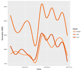
Figure 15. The standard deviation of half hourly wind generation in New South Wales, South Australia and Victoria: five minute intervals: September 1 2015 to 16 January 2017.
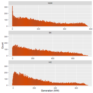
The distribution of wind generation in each state is shown in Figure 16. The distributions are all strongly skewed to the right with a fat tail. So, while low and even zero levels of output quite common there still are relatively frequent high levels of generation. South Australia has a longer and fatter tail. The former is due to greater capacity but the fatter tail is likely to reflect a difference the wind resource. New South Wales has a substantial number of zero generation intervals and Victoria more low generation intervals when compared to South Australia.
Figure 16. The distribution of the change wind generation in New South Wales, South Australia and Victoria: September 1 2015 to 16 January 2017.
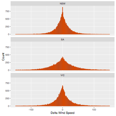
Turning to time scale of volatility, we can compare the in the change in wind generation between five and 30 minute intervals. The distribution of the change between five minute intervals is shown in Figure 17 and for 30 minute intervals in Figure 18. The spread of both the distributions is considerably wider (less peaked) in South Australia compared to Victoria which in turn is substantially wider than in New South Wales. While the differences may be mostly due to installed capacity, the wind resource also seem to play a role particularly between New South Wales and Victoria.
Figure 17. The distribution of the change in wind generation, delta, between five minute intervals New South Wales, South Australia and Victoria: September 1 2015 to 16 January 2017.

In moving from 5 to 30 minute intervals the change in the distributions is also quite striking. The range roughly doubles and the tails due fatten, especially in South Austria. This is due to the positive temporal correlation in the changes in generation through the half hour intervals. In other words, the five-minute changes tend to be more strongly negative or positive as opposed to random with the half hour.
The implications are a little easier to see in Table 3 in which the upper percentiles of the distributions are shown (the distributions are quite symmetric so the lower percentiles will roughly mirrored, the 1st per centile the opposite in sign of the 99th). In South Australia 10 per cent of the variation between five minute intervals was over 15MW. This more than triples to 48 MW between 30 minute intervals. This threefold increase is consistent through the upper percentiles in South Australia and there is a similar though smaller pattern of increase in the other regions.
The NEM maintains ancillary generation services to continuously manage very short term fluctuations in generation and load, referred to as regulation frequency control. Regulation is required because there is not sufficient time to adjust output through the dispatch of price and energy bids from generators. However, a lower level of variability can make this essential service more manageable and less costly to deliver. The converse is also true, as the level of reliability of the service needs to maintained.
The median supply of regulation frequency control in South Australia was 60MW which is more than the 99.5 per cent of variation in half hourly wind generation. The supplies of these services can be adjusted to meet anticipated increases in variability in generation and load. For example, in 20 per cent of the same period, the supply of regulation frequency control was over 100MW.
Figure 18. The distribution of the change in wind generation, delta, between 30 minute intervals New South Wales, South Australia and Victoria: September 1 2015 to 16 January 2017.
The greater level of variability in half hourly generation can be managed though the dispatch of higher and lower priced energy bids from generators. These prices and offers form the spot market for electricity generation. Consequently, variability in wind generation can impact on the variability of spot market prices. How big this impact will depend on the current state of the market. For example, four per cent of the variation in half hour prices in South Austria was between roughly 70MW and 120MW (the difference between the 95th and 99th percentiles). If over the corresponding times, there were available energy bids for this range of power close to the current prices, the impact would still be small. One can construct examples in which the impact would be large. The extent to which conditions promote high levels of price variability frame the empirical question of interest here.

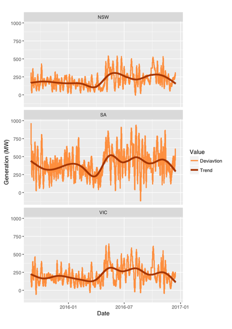
However, the temporal correlation in wind generation can create different levels variability in output at longer and often irregular time scales. We can get a sense of this by looking at the deviation of wind generation about the trend in average wind generation (as shown in Figure 14). To do so we are going to use a much finer smooth of the deviations about trend as opposed to the trend itself as we are interested in capturing relatively short term patterns due to changes in wind velocity. Further, the regular diurnal pattern in wind generation over the period has been accounted for in the smooth to focus more on changing weather patterns. The results are shown in Figure 19.
The figures illustrate how temporal correlation can generate short, sharp and irregular cycles, referred to a ramp events when they occur in real time. The general pattern is again similar in each region, all showing a marked increase in volatility in 2016. However, South Australia clearly stands out not only in terms of the magnitude of the swings but the frequency with which generation moves from well above to well below trend.
The time scale of these swings is considerable longer the half hourly but their speed, severity and irregular nature may be more difficult to manage, at least in terms of cost, though the dispatch process. Picking the extremes or turning points in such conditions may be on the edge of impossible. The system just needs to be sufficiently resilient and that may, at times, prove costly.
At the same time, pattern of these large swings in wind generation in South Australia fit visually with the shift in the changing distribution of prices over time presented in the very first blog. While not a sound basis for drawing conclusions, the dynamics wind generation and prices in South Austria look to be worth investigating.
Figure 19. The trend and deviation about trend in wind generation in New South Wales, South Australia and Victoria: September 1 2015 to 16 January 2017.
Is SA Causing Wider Spread Price Volitility
The increase in prices and price volatility observed in NSW and Victoria raise the question whether the source of this change is attributable, to a substantial extent, to South Australia. From a statistical perspective, causality is a difficult issue to address in a complex system. To start, there is need for a supporting physical explanation for the hypotheses to be tested, which cannot be offed here. However, statistical evidence of causality can be a necessary if not sufficient condition in establishing causality.
To consider causality, we need to depart from the visualisation approach that has been adopted so far. Granger causality is a relatively easy to understand statistical test of causality, which is based on temporal correlation (see https://en.wikipedia.org/wiki/Granger_causality). The idea is that what is happening, say in NSW, can be predicted by what has happened recently in that region. If what has happened recently in South Australia adds significantly to the quality of that prediction, then there is evidence of cause and effect.
Briefly, the procedure used for the tests of causality in NSW and Victoria is to: transform our volatility measure, the mean absolute deviation in price from trend, in each region. The purpose is to create a volatility distribution that is approximately normal. To do so we use a cube root (as say opposed to a logarithm square root as deviations are both positive a negative). The next step is to use robust regression (https://en.wikipedia.org/wiki/Robust_regression) to estimate volatility in a given region as a functions of past volatility in all the regions. Lastly, standard errors are corrected for temporal correlation and variation when estimating the precision and the significance of the estimates.
The results are summarised in Table 2. It should be noted that the closer the significance level is to zero, the more significant is the result (the confidence level is equal to one minus the significance level). The results of the NSW regression show that price volatility in South Australia and Victoria have a highly significant and positive impact on price volatility in NSW. The results of the Victorian regression show that price volatility in South Australia has a highly significant and positive impact on the price volatility in Victoria. Lastly the South Australian regression is highly symmetric with respect to that of Victoria, with volatility in Victoria impacting on volatility in South Australia. Volatility in NSW does not significantly impact on South Australia.
On balance, therefore, the results of the causality analysis are consistent with the conclusion that the volatility in spot price in South Australia has been passed on to NSW and Victoria. The results that price volatility in Victoria is impacting on NSE and Victoria suggests that the source is not confined to South Australia and while NSW may not be contributing to price volatility in South Australia and Victoria, it has a stake in sorting out the issue.
It appears that the high share of wind generation in South Australia may play central but not a singular role in creating higher levels of price volatility and consequent higher prices. The next few blogs will look more directly at wind generation and prices in South Australia.

Price Volatility in Other NEM Regions
While an increase in the variability of demand in South Australia may be a very unlikely source of the observed increase in the variability and consequent increase in prices in South Australia, there are other candidates. These include:
· the natural variability in dispatched wind generation in South Australia;
· transmission constraints in and out of South Australia; and
· variability in market conditions in other NEM regions that also affect South Australia.
Before looking look directly at the variability of dispatched wind generation in South Australia it is interesting to look at what has been happening in other states for a few reasons.
First we can see whether the problem is unique to or predominantly occurs within South Australia, or whether it is symptomatic of a wider problem across the Eastern Seaboard. This approach goes beyond addressing the third possible source. Wind generation accounts for a much larger proportion of dispatch in South Australia than it does in the other regions, so if the variability of wind generation is a driver of price variability, it should predominantly manifest in South Australia. Second, if price volatility is unique to South Australia, then it would be reasonably clear that whatever its source, the increased price variability it is not being passes through to the other regions. Third, if there is a similar pattern of prices and prices variability in other regions, this raises a critical question whether the problem affects the Eastern Seaboard as a whole, or whether what is happening in South Australia is impacting on other states.
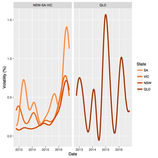
Smoothed prices for the other NEM regions (excluding Tasmania) are shown in Figure 9, while corresponding levels of price volatility are shown in Figure 10. Queensland is shown in a separate panel as it is clear that different patterns in prices and price volatility prevail there. While there is a strong relationship between average prices and price volatility, as measured by the mean absolute price deviation about trend, we will keep the focus here on NSW, South Australia and Victoria.
From the two figures it is clear that the escalation of average prices and price volatility in 2016 has predominantly occurred in South Australia. However, there is a similar but dampened pattern in New South Wales and Victoria. This suggests that what is occurring in South Australia is either occurring in the other regions to a lesser degree or that what is occurring in South Australia is impacting across the system.
Figure 9. Smoothed prices in NSW, Queensland, South Australia and Victoria: 15 October 2012 through 15 October 2016.
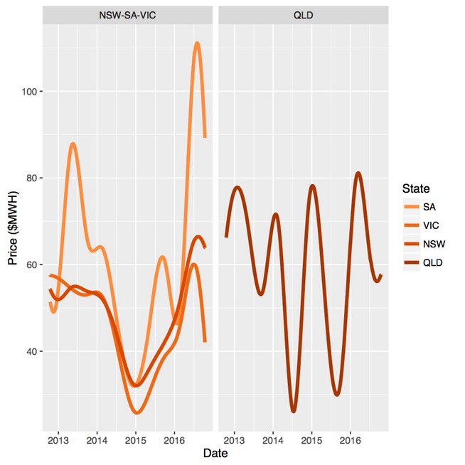
Figure 10. Price volatility in NSW, Queensland, South Australia and Victoria: 15 October 2012 through 15 October 2016.
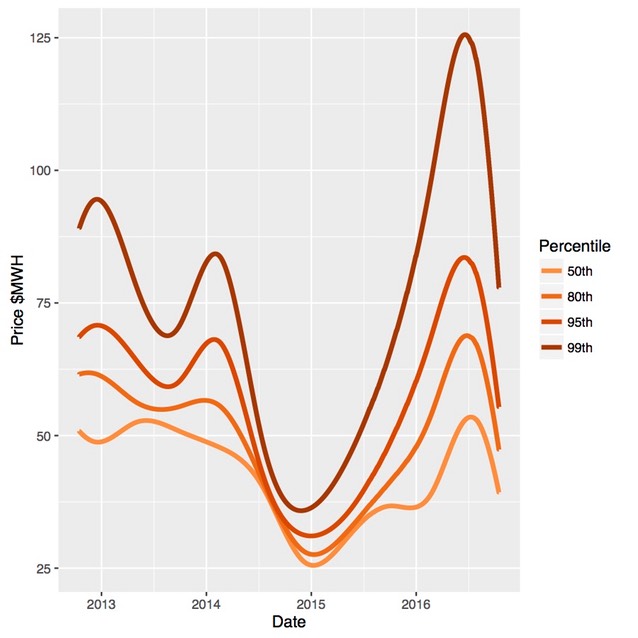
We can take a closer look at what has been happening to the price distributions in NSW and Victoria using the same quantile graph as was done for South Australia. The evolution of the distribution for NSW is shown in Figure 11 and in Figure 12 for Victoria. The same pattern emerged in 2016 in these regions, but on a different scale. This includes the shift of the 80th percentile which has not generally occurred in the past during periods of elevated price volatility. It is immediately apparent that the evolution of the price distributions in NSW and Victoria are very similar.
Figure 11. Quantiles of the electricity price distribution for NSW: 15 October 2012 through 15 October 2016.
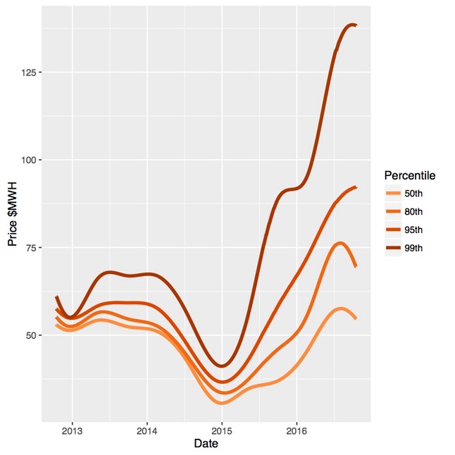
Figure 12. Quantiles of the electricity price distribution for Victoria: 15 October 2012 through 15 October 2016.
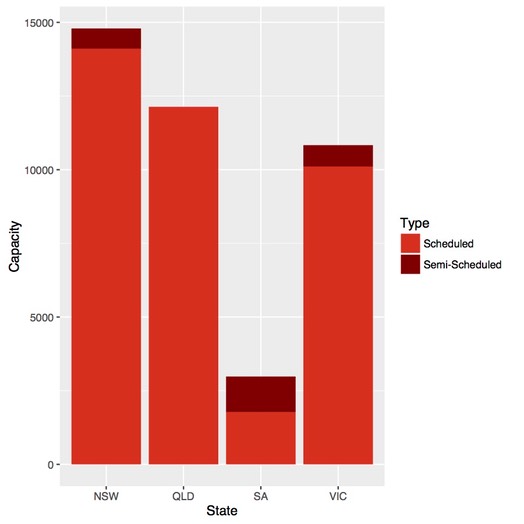
This does not resolve the question of whether increased price volatility is predominantly due to a system wide issue or is localised in South Australia. However there are two clear differences in the generation profiles of NSW, South Australia and Queensland as can been seen in Figure 13. South Australia has relatively high proportion of wind generation which is a debated potential source of price volatility. Two, South Australia represents a relative small proportion of total generation and as such might not have a substantive impact on the rest of the grid. This brings to the forefront the question of causality.
Figure 13: Installed and committed scheduled and semi-scheduled generation capacity
South Australian Electricity Demand
In our previous blog we looked at surging electricity prices, particularly in South Australia. One possible reason is an increase in the volatility of operational demand; i.e. electricity drawn from the grid by consumers, but excluding electricity generated from unmeasured source such rooftop solar systems and other small-scale generating sources.
Volatility in the output from these unmeasured sources, which has been increasing in absolute and relative terms, would lead to greater demand volatility, which may in turn impact on energy prices in the spot market.
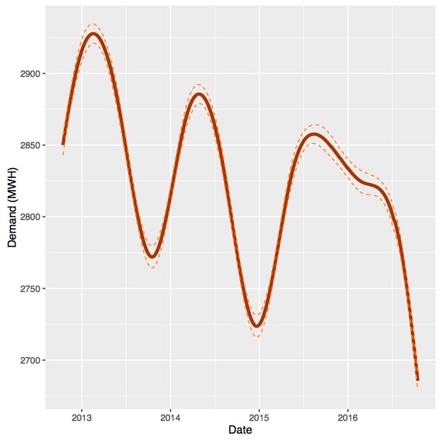
We can look at the trend in the level and volatility of operational demand in the same way we looked at prices using an optimised smooth. The trend in South Australian electricity demand is shown in Figure 6. The figure shows a seasonal component, but also a steady decline in trend, which, at least in part, would be due to an increase in the deployment of rooftop solar systems.
Figure 6. The trend in electricity demand in South Australia: 15 October 2012 through 15 October 2016
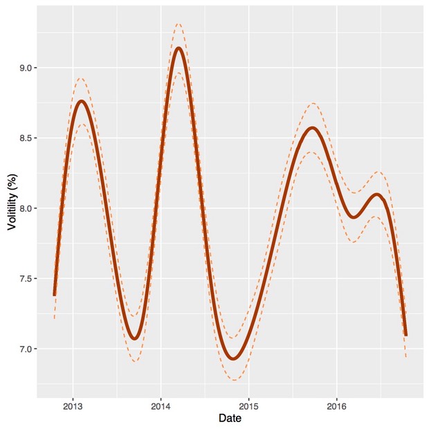
The trend in volatility, as measured by the absolute mean percentage error about the trend in demand, is shown in Figure 7. There is a slight decline in volatility over the period but in any case, there has not been an appreciable increase, so it appears that the increase in price volatility is not due to demand or volatility of unscheduled generation including rooftop solar. However, solar generation is diurnal so it would be useful to check if the variability of the diurnal trend has increased.
Figure 7. The trend in the volatility of demand in South Australia; 15 October 2012 through 15 October 2016
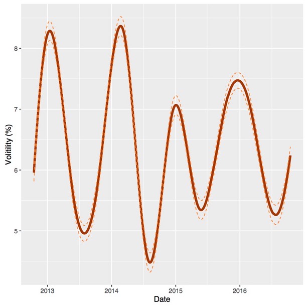
We can do this by fitting a linear regression model with time, on a half hourly scale, as a factor (dummy variable. We can the extract the trend in absolute values of the residuals about the diurnal pattern in demand. This is just another measure of volatility, expressed as percentage of the mean predicted diurnal trends, and is shown in Figure 8. There is a modest but steady decrease in the volatility of demand about the diurnal trend. In any case, the conclusion that the variability of rooftop solar, or other non-scheduled generation, has been responsible for the increased variability in prices is clearly not supported. The volatility in demand about trend is no greater that what has been observed in previous years.
Figure 8. The trend in volatility about the diurnal trend in demand in South Australia; 15 October 2012 through 15 October 2016
Prices and Price Volatility
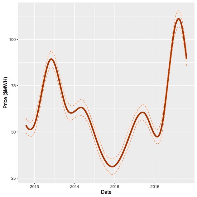
We start by smoothing out the variability in prices to obtain a trend in average prices in South Australia over the last four years which is shown in Figure 1. The smooth is an estimate of a conditional mean, or the average price at particular point in time. As with all estimates it is subject to error and the 95 per cent confidence bounds for the estimate are also shown in the figure. As the beginning and end of the smooth are not strongly support by the data, two months of data or approximately 2,900 observations are removed from the beginning and the end. So the data used in the smooth runs from mid-August 2012 to through mid-December 2016 but is shown in the graphs for a shorter period. Nevertheless, the beginning and the end of the smooths shown in the figures should still be viewed as being dependent on the period shown.
The idea behind the smooth is to show the underlying trend in prices at a meaningful time scale while retaining a reasonable degree of fidelity with the underlying variation in the prices over time. The impact of the carbon and tax and its repeal, a strong seasonal component and the surge in prices in 2016 are all quite evident. At the same time, hourly, daily and weekly variability is not.
Figure 1. Average prices in South Australia: 15 October 2012 through 15 October 2016
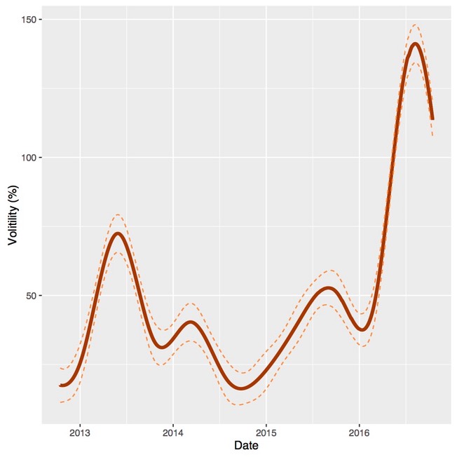
The price deviations from trend can be expresses as a percentage of the average price, which is a standardised measure of price volatility known as the mean absolute percentage deviation. We can smooth these deviations to get a picture of how price volatility has evolved over the last four years, as shown in Figure 2. The sharp increase in price volatility in 2016 as well as the overall seasonal pattern is quite evident. A visual comparison of Figures 1 and 2 shows a common pattern, high prices are associated with high price volatility.
Figure 2. Price volatility as measured by mean absolute percentage deviation in South Australia: 15 October 2012 through 15 October 201616.
Average prices and price volatility
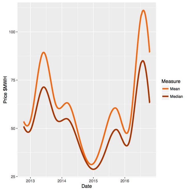
The relationship between price volatility and average prices can be viewed from another perspective. The median price, or 50th percentile, is at the midpoint of the price distribution and should be pretty much unaffected by price volatility. However, the imposition and repeal of the carbon tax or an increase in gas prices will be clearly seen in the median. If the price distribution is symmetric (or evenly balanced about the median), the average price will be the same as the median price. However, as the relative frequency of high price events increases the average price will be driven above the median.
Average and median prices over the last four years are shown in Figure 3. It is interesting to note that median prices increased in 2016 to about the same level as when the carbon price was imposed, perhaps reflecting higher gas prices. However, what is also clear is that during peak price periods the divergence of the average from the median has become more pronounced.
Figure 3. Median and mean prices in South Australia: 15 October 2012 through 15 October 2016
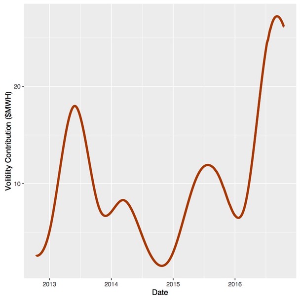
The difference in the average and media price, shown in Figure 4, is a rough measure of the contribution of high price volatility to the average price. It appears that during seasonal peaks, upside price volatility makes a substantial contribution to average prices, rising to over $25/MWh in mid 2016.
Figure 4. The contribution of price volatility to average prices in South Australia: 15 October 2012 through 15 October 2016
The distribution of prices
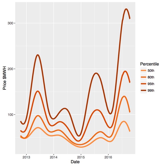
The techniques used to estimate the trend in median prices can be used to estimate how other percentiles of price distribution have changed. The trends 50th, 80th, 95th and 99th price percentiles for South Australia are shown in Figure 5. It is important to keep in mind the differences between the percentiles; that is, 30 per cent of all prices lie between the 50th and the 80th percentiles, while only 1 per cent of all prices are above the 99th per centile.
There are a few points to note. First, in peak seasons, the upper percentiles diverge from the median, particularly at and above the 95th percentile. However, in 2016 a larger proportion of the tail of the distribution shifted upward, as can be seen in the 80th percentile. This is concerning as it explains, in large part, why the increase in volatility has had such a large impact on average prices. Lastly, the 99th percentile appears to escalated sharply. This might be a bit concerning but the accuracy of estimation can decline quickly at upper quantiles and it will be interesting see if this trend persists into periods of 2017.
Figure 5. Trends in distribution of prices in South Australia: 15 October 2012 through 15 October 2016
If the increased volatility of prices persists or recurs in 2017, this will poses a serious challenge. Regardless of its cause, a substantial increase in average prices will be passed on to users. Such outcomes may be indicative of systematic problems within the electricity system, and any solution which will depend on the source or sources of the problem. Some further analysis is intedend to provide some insight into the potential causes.